Error handling in CSS
.undefined class
asdf
Sassy CSS
I started using CSS preprocessors many years ago and I switched from LESS to SCSS since then. I use sassc, because the official transpiler is too heavy for my taste. Sassc is just shy of 4 MB and dotless was even only 152 kB! That's my primary reason I don't use webpack or similar tools.
I use it in PhpStorm as a global File Watcher (Settings > Tools > File Watchers) for SCSS files, with arguments -m auto $FilePath$ $FileDir$\$FileNameWithoutExtension$.css, which outputs the CSS file the same directory ($FileDir$).
Even better would be to put the CSS files into final directory, so you don't mix SCSS and CSS. The -m auto means it generates a source map as well, so in browser's DevTools I can see the correct row in the .scss file, so I don't have to look for it from the row in transpiled .css file. So convenient!
I don't use auto-save trigger option, because it often tries to compile during edits, when the SCSS is not yet valid, so the console pops up with an error, as it should.
But I have to admit, I use preprocessors mainly as a future-proofing, because so far I didn't see any major benefits, other than the result is in a single CSS file.
I like multiple source files, but there's @import in CSS. I like variables, but there's `var(--name)` in CSS. I don't use nesting, because when I need to fix something, it's often hard to find, and I learned to use custom classes wherever suitable. Functions and mixins add bloat to the stylesheet in my opinion and my target is to have it as slimmest as possible.
The only real upside of a CSS preprocessor for me are comments. I somewhat dislike block comments, because you can't comment out a block of commented code, and there are no line comments in CSS – but they are in preprocessors.
The other upside would be more permissive syntax, but the only real permissive preprocessor is Stylus and I hate significant whitespaces, not to mention I don't like some syntax decisions they made.
I admit it's nice not to care about (semi)colons and I'm sometimes furious about multiple selectors on one declaration, when I want to sort them in particular fashion I have to replace curly brackets and commas all the time.
Anyway, It feels to me the target audience of preprocessors are web designers, who have CSS as their main work, unlike me, who write CSS only because I need to.
SVG, Sometimes Verbose Gibberish
For icons and glyphs I've always preferred webfonts, because they're easier to work with and has much lower impact on CPU. But they're not easy to create, fortunately there are services like Fontello, that allows to pick only what I need.
Inline SVG in CSS
- background-image: url('data:image/svg+xml;utf8,<svg height="16" version="1.1" viewBox="0 0 48 48" width="16" height="16">...</svg>');
no easy :hover color change
Mismatched markup, unnecessary namespaces, ballast metadata from editors, empty <g> elements etc.
Editing by hand, simple HTML editor
box-sizing: border-box;
One of the biggest pains in a web development, apart from vertical centering (except for inside a table cell), is a W3C box model, which doesn’t include padding and borders into the width. You can’t use “padding: 10px; width: 100%;“, because the element will be 20px wider, than the parent element.
Fortunately, in CSS3 there’s box-sizing property. Default value is “content-box”, which behaves as the W3C model, but if you set the property to “border-box”, it solves the problem with padding/border and the width. I noticed almost all major CSS frameworks adds this property to every element, like this:
- * {
- box-sizing: border-box;
- }
In the past (in terms of internet it's rather ancient history), comparable pain was an old Internet Explorer’s own box model concept, which included border and padding into the width (so basically like “box-sizing: border-box”), whilst Netscape Navigator (ancestor of Firefox) followed W3C standards.
Side note: I don’t like when Microsoft, or any other company for that matter, does stuff in their own way, but this was actually better, than standards.
Anyway, when designing a web page you had to hack those differences, usually by using two divs instead of one. Outer div had the 100% width, inner div had the padding and border. Width of the inner div has been calculated automatically. And this wasn’t the worst hack at the time, webdesign was often close to a witchcraft :-)
Microsoft added “standard mode” (now we call it “almost standard”) into IE6, but kept so called “quirks mode” default and switching of those modes has been guided by DOCTYPE. This changed with IE7, where W3C mode became default (according to my test in IE11 dev tools).
Now, if you use HTML5 doctype <!DOCTYPE html>, you will get the best results – so use it always!
And about the vertical centering, you can use display property with CSS2.1 value “table-cell”, so even div can behave like a table cell, with working vertical-align: middle, like this:
- .verticenter {
- display: table-cell;
- vertical-align: middle;
- }
But don’t forget you should to make it a proper table! So parent div will have “display: table-row;“ and it’s parent div will have “display: table;“. Happy styling!
CSS performance
Be aware, that 4G/LTE or even 3G is still a dream in a lot of countries. You should build your responsive design to work as a lite version on mobile devices – without large cover images, animations, effects, transitions, shadows and gradients, because they are CPU heavy and drain batteries much faster.
- @media only screen and (max-width: 640px) { ... }
Many effects, achieved by images in the past, are nowadays possible just by CSS effects. They are significantly smaller, of course, but increases CPU time required for their rendering. A lot of shadows and gradients, but also transitions and animations may kill performance on (low end = mostly used) mobile devices and drain their batteries faster.
Also you can omit webfonts on mobile. The only sensible use there is for icon fonts, but nowadays it's better to use SVG for that. Keep in mind you can't change it's color e.g. on :hover, if you use the SVG as background.
Selectors are evaluated from right to left, so “#main a” means browser would have to find all links anywhere on the page and then traverse the object tree for every single one of them to find which one has any descendant with id="main".
The fastest selectors are “class” and “id”, the slowest are attributes and pseudo-classes/-elements. But before you start rewriting your CSS into classes only, it would probably gain just milliseconds. Selectors performance is a job rather for browser creators, than web devs, and there are tons of more efficient optimizations. But it's good to know about it and use it as much as possible.
The best you can do with your selectors is use less of them, not overqualify them (instead of ul li span you may use just li > span) and benefit from inheritance more. And if you use a CSS preprocesor, check the output it makes – some of them generate tons of long descendant selectors.
LESS CSS
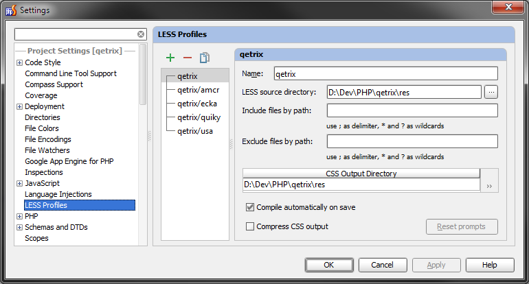
Because of my current sort of trip out of my programming comfort zone, I decided for Quiky web app to try something I read a lot about recently – CSS preprocessors. From the triumvirate of most popular ones I chose LESS, because I saw it around me the most.
I installed a plugin for PHPStorm (built-in wasn’t working for me), called LESS CSS Compiler. As I would expect, it compiles CSS from LESS source on each save. It requires setup of profiles, specifying where to search for LESS and where to put CSS, which is understandable, but I’m keeping both in the same dir and because each app has it’s own LESS/CSS, it turns to be quite annoying, because I have to do the setup again each time I try to make a new app.
LESS works for me really well, I can say I’m happy to start with that. So if you hesitate, like I did, don’t worry. It will open many new opportunities.
If you create more projects based on the same HTML structure, or you are just not sure about if shades are right, you can define variables for colors and it will definitely saves you more time time than it takes to make it work.