Psychology
Vacuum cleaners are louder, because noise is perceived as power, so quieter are considered less powerful. Also they amplify the noise of debris hitting the tube for better feeling from vacuuming.
Colors mean various stuff:
- Black: Strength, Elegance, High Quality, High Tech.
- Blue: Integrity, Trust, Security, Wisdom, Reliability, Sadness.
- Red: Love, Power, Heat, Speed, Urgency, Fear, Danger.
- Green: Envy, Wealth, Luck, Success.
- Orange: Happiness, Fun, Optimism, Cheapness, Caution.
- Pink: Romance, Youthfulness.
- Purple: Royalty, Magic, Courage, Creativity.
- White: Purity, Lightness.
- Yellow: Joy, Positivity, Jealousy.
https://www.empower-yourself-with-color-psychology.com/website-colors.html
Content styles
At high school in the informatics class, our teacher required us to use styles in MS Word. We didn't comprehend it much, because it was simpler to just format the text, but later I really appreciated the drill. Styles are highly useful and nowadays it's a real pain to edit documents that don't use them.
Well, actually everybody I know, who themselves adopted the concept of styles, have the similar problem with poorly styled documents. Styles are like a batch format update, which can't be done easily with formatting.
CSS is nothing different and therefore I highly utilize styles in all content editors I created so far, including Quiky. I'm more on the opposite side, I don't offer paragraph formatting at all and allow only paragraph styling instead. Formatting is for inline text only, like bold or italics, but not underline, because user might confuse it with a link.
It's in compliance with general guidelines of typography – a paragraph should use only a single font and single font size, which on websites are defined anyway. Changing color may be a problem, if you decide to restyle your site in the future and use different background color (like a dark version) and may impact accessibility for impaired users. The latter requires color not to convey any additional meaning, rendering it quite useless.

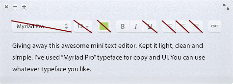
I found a mock, where almost every toolbar item is... meh.
I can't remember when I used other paragraph alignment than left or justify. Centered text is in this case mostly just for quotes, headlines or poems, and that is possible with appropriate style. Right aligned text is a bad idea overall, at least for latin-based texts.
Similar rules goes for left indentation, which should be available only for lists, to change item levels, or code fragments, so those buttons can be contextual. There's no other use for indented text on the web.
I suspect many WYSIWYG HTML editors go with “more buttons looks better”, but the truth is, that more buttons only brings clutter. If users don't use it regularly, don't shove it into their faces, and if they do, they may already use a keyboard shortcut to do it.
Fortunately, major editors already adopted this idea, so the days of HTML editors with three rows of toolbars are mostly over.
It's all the same!
The evergoing theme in QetriX is to unify things as much as possible. This was the case for components in the first place, notably for QList: everything with repeating pattern is just a list of stuff, no matter if it's a navigation, gallery, table, slider, search results, blog or whatever.
But this approach applies even to other aspects. There's not much of a difference between table row and a form. That was another breakthrough idea for QetriX, allowing me to merge QFormControl and QListItem into QElem, so-called “data element”.
QElem contains value and it's specification, notably data type. In QForm it's a form control, in QList it's mostly a table column (because table is the most used implementation of QList with variable data model).